
Taylor Swift and the Architecture of a Wedding Invitation: Storytelling, Secrecy, and Spectacle
- Karina Gaio
- 1 day ago
- 5 min read

Updated: 20 hours ago
A Cultural Essay on Narrative, Color, and the Modern Invitation.
The Artist as Architect
Some artists release songs.
Some construct eras.
Taylor Swift has trained her audience to decode. Symbols are not decorative. Color is not accidental. Chapters are not chronological; they are strategic.
When someone builds a career on narrative architecture, even private milestones become chapters.
A wedding invitation, in that context, would not be correspondence.
It would be authorship.
What follows is not speculation about a person. It is an exploration of how narrative behaves when translated into paper.
Cultural figures become design case studies when their narratives are this controlled.

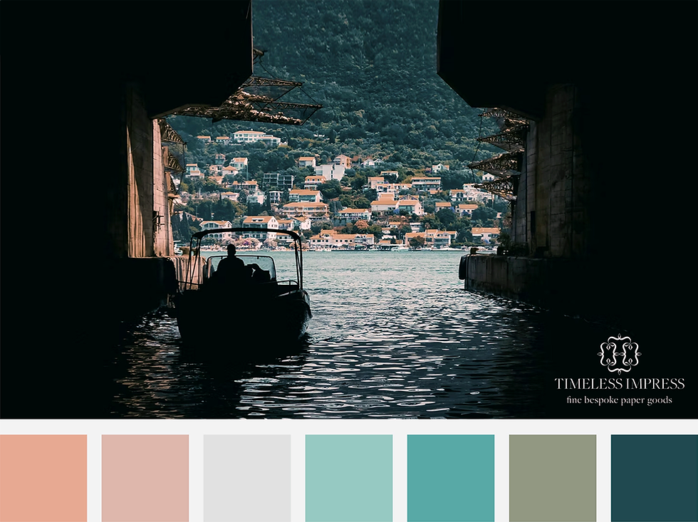
Mediterranean Light, 6:42 PM
Let’s speculate, carefully.
Not on dates. Not on logistics. On atmosphere.
If this were a destination celebration, it would not be predictable Tuscany. That landscape has been absorbed by algorithm. It photographs beautifully but says little.
Côte d’Azur, The Riviera, somewhere between Cannes and memory, that is different.
There, limestone turns gold at 6:42 PM. The sea flattens into a brushed cobalt surface. Bougainvillea climbs sun-warmed facades in deliberate excess. The light itself edits.
Under that sky, narrative shifts.
Here is what that story looks like under Mediterranean light at 6:42 PM:
Ivory that reads like heritage.
Blush that feels inherited rather than trendy.
Cobalt that belongs to evening.
Red that refuses to apologize.
Not decorative color. Narrative color.
The Cinematic Chapter
Her recent visual language leans theatrical. Saturated reds. Burnished neutrals. Stage-lit contrast.
The showgirl palette: crimson, garnet, copper, deep merlot, does not whisper. It performs.
Translate that to paper:
Heavy cotton stock in warm bone.
Embossed crests pressed like theatre marquees.
Foil that catches light the way a spotlight finds a performer mid-aria.
Layered panels creating literal depth.
Die-cuts casting shadow.
Opening the invitation becomes staging.
Not opened. Experienced.
This is not stationery. It is set design in miniature.

Teal and Tension
But spectacle alone is incomplete.
The teal and orange dialogue, that cinematic pairing, signals contrast. Warmth and coolness in tension. Intimacy against horizon.
If incorporated into invitation design, it would appear in restraint:
A teal silk ribbon against a burnished copper edge.
A cobalt envelope liner revealed only when unfolded.
Typography in deep marine ink against clouded ivory.
Control. Not chaos.
Narrative tension expressed through chromatic balance.

The Secret Garden Interlude
Then there is the proposal language, the garden vocabulary.
White Duchess peonies: prosperity, permanence.Ivy: fidelity.
Delphinium: openness of heart.
Pink resurrection lilies: rebirth, unexpected joy.
A proposal framed in florals is already storytelling.
If that story continued into wedding design, we would see:
Off-white as continuity.
Lavender as intimacy.
Soft green as reinvention.
Red as signature.
The floral palette becomes structural rather than decorative.
Each bloom a footnote.

The Heritage Layer
Public persona suggests polish. All-American composure. Structured restraint.
That reads as:
Blind embossing.
Classic serif typography.
Margins that breathe.
The kind of elegance that photographs beautifully and offends no one.
But the storyteller does not settle there.
Duality must integrate.
The polished heritage layer would ground the more theatrical elements. One tempers the other. Discipline beneath drama.

The Retro Infomercial Chapter
Recent visual cues nod to a curated 90s nostalgia. Soft-focus optimism. Analog warmth. Controlled camp.
That palette: mustard, burnt orange, slate blue, avocado, lacquered red; feels archival.
In invitation terms, that might surface subtly:
Custom stamps referencing vintage ephemera.
Wax seals pressed imperfectly.
A printed insert resembling an old concert program.
Not parody. Reference.
Because narrative-driven design always references something older than itself.

Wes Anderson, Explained
For readers unfamiliar with his work: Wes Anderson is a filmmaker known for hyper-composed symmetry, deliberate color palettes, and theatrical framing. Every frame looks designed, not accidental. Nothing is casual.
That approach parallels this speculation.
Intentional margins.
Symmetry as emotional cue.
The Royal Tenenbaums palette: mustard, brick red, faded blue, olive; feels curated, nostalgic, precise.
A wedding invitation influenced by that discipline would feel archival. As though it already belonged in a museum drawer.
Design not as decoration.
Design as authorship.

The “87” Detail
Subtlety matters.
An embossed “87” hidden within a monogram.A date aligned intentionally to mirror a narrative beat.Typography that only reveals its meaning upon closer reading.
Swift has trained her audience to look twice.
An invitation within that ecosystem would reward attention.
Not obvious. Layered.

Privacy as Structure
High-profile celebrations operate within controlled ecosystems.
Discretion, when integrated intentionally, becomes structural.
Imagine a Save the Date accompanied by a confidentiality agreement, not as a legal afterthought, but as part of the suite’s architecture.
Confidential inserts printed on the same stock. Coordinated typography. Margins that echo the main invitation.
An NDA aligned with the aesthetic language of the celebration itself.
Privacy does not dilute design.
It refines it.
When handled with care, even silence has texture.
Anticipation, too, can be choreographed.
In that context, restriction becomes ritual.
The Invitation as Cultural Object
Whether such a wedding ever materializes is secondary.
The design question stands alone:
What happens when an artist whose currency is narrative applies that logic to ritual?
Color becomes mythology.
Margins become meaning.
The invitation would not whisper by accident.
It would declare, deliberately.

A Final Note
Whether such a wedding ever materializes is almost beside the point.
The question was never about confirmation. It was about construction.
When an artist builds her career on coded eras, symbolic color, and emotional choreography, even a private milestone would follow that same logic. Not louder. Not larger. But intentional.
Because when narrative is your medium, paper cannot be incidental.
It becomes thesis.
And if a wedding invitation ever emerges from that world, it will not whisper by accident.
It will speak: in color, in texture, in restraint; exactly as designed.
Designed Ritual is a reflection on ceremony, symbolism, and the architecture of meaning. Because when narrative defines a celebration, design does not decorate the moment. It authors it.


Comments