
Wedding Stationery Trends for 2026: The Year of Story-First Design
- Karina Gaio
- Dec 3, 2025
- 3 min read

Updated: Dec 5, 2025
At Timeless Impress, we’ve always believed that custom design isn’t just about aesthetics, it’s about storytelling. And in 2026, that philosophy is taking center stage. This year, wedding stationery is less about flashy finishes and more about intentionality, craftsmanship, and meaning.
Couples are prioritizing the guest experience like never before and that experience begins the moment the invitation arrives. It’s the first impression, the spark, the "love at first sight" that sets expectations for what’s to come. At Timeless Impress, we reverse-engineer the invitation from the vision of the celebration, ensuring every design choice has purpose and resonance.
Here’s what’s defining 2026 stationery, with real-life examples from our studio that show how thoughtful design can be both accessible and extraordinary.
1. Intentional Color Palettes That Set the Tone
Forget seasonal trends, in 2026, color is personal. From the serene tonal layers in Tropical Chic Paradise to the vibrant, mood-setting palette in Margaret’s Quinceañera, couples (and quinceañeras!) are choosing colors that reflect identity, emotion, and theme.
Margaret’s celebration embraces a monochromatic pink palette that ties into her candy store-inspired theme: sweet, immersive, and completely tailored to her vision.
Why it matters: A color palette can hint at a story long before the event, and when applied consistently, it becomes unforgettable.
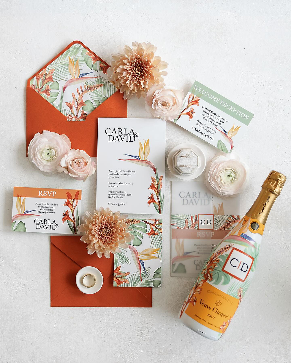
Vibrant tropical wedding invitation suite with custom bottle label, floral accents, and curated guest welcome details. Photo by: @veronicacastillodesign
2. Craftsmanship Over Cost: Bespoke on Any Budget
In Katie and Sachin’s Curated Wedding Capsule, we used blind embossing and pressure plate techniques to elevate minimalist layouts and create luxurious texture , no hot foil needed. Guests were so moved by the experience that the couple personally thanked Timeless Impress in their reception speech.
Why it matters: You don’t need gold foil or acrylic to feel luxe — intention and craft are what truly make an impact.

3. Designing the Guest Experience from Invitation to Celebration
For Katie and Sachin, we carried their invitation’s mood through every detail, from bespoke welcome bags inspired by their travels, to on-the-day pieces that echoed those original design elements. Every guest received something purposeful, building a cohesive, immersive journey.
Why it matters: Invitations are just the beginning. In 2026, design is unfolding like a story with subtle reveals and emotional continuity throughout the event.

4. Themes Done Thoughtfully: Margaret’s Quinceañera
This year, we’re bringing that same custom sensibility to a celebration bigger than many weddings: Margaret’s Quinceañera. The soft pink invitation suite featured candy shop cues that will appear again at the event: embossed details, textured papers, and sweet-inspired motifs that lead to real on-the-day experiences.
Why it matters: Themed doesn’t have to mean cliché. It’s about carrying an idea with elegance and intention.

5. Patterns, Liners, and Local Influence
From the citrus-infused freshness of Azure & Zest to the floral vibrance of Mediterranean Bougainvillea, we’ve layered destination details into every inch of our paper goods including envelope liners and inserts. The design doesn’t stop at the card, it surrounds the guest in atmosphere.
Why it matters: Design that references place, season, or setting creates a sense of anticipation and belonging.


Custom Design Is a Mindset, Not a Price Point
This year is proof that bespoke doesn’t have to mean extravagant. It means thoughtful. It means telling a story through layers, materials, and carefully curated details. It means designing for the people you love, not the trends you follow.
Discover our forecast of Cloud Dancer, the Pantone Color of the Year 2026
Ready to create something unforgettable? Let’s imagine your celebration together and work backwards to an invitation that sets it all in motion.
Explore our portfolio to see how these 2026 trends come to life.


Comments